It's been a while since my last post on gnuplot, and this one is not going to be very technical. I just wanted to call your attention to the second edition of Philipp Janert's brilliant book, Gnuplot in action https://www.manning.com/books/gnuplot-in-action-second-edition. The book contains a hefty dose of gnuplot recipes and plotting tricks, all in an easy-to-follow fashion. In fact, I would go as far as saying that Gnuplot in action is the definitive book on this software. I would also point out that this second edition focuses on the new features of gnuplot 5.0, which was surreptitiously released about a year ago http://gnuplot.info/ReleaseNotes_5_0_3.html. Many newly-introduced features render the tricks discussed on this blog obsolete, and plotting with gnuplot is much hassle-freer now.
Cheers,
Zoltán
Monday 14 March 2016
Tuesday 21 September 2010
Projecting contours
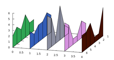
Karl asked a question some time ago, in which he wanted to know how one can produce this graph. As I pointed out in my reply, it is rather easy, if we can rotate the data file by 90 degrees. I will only post a skeleton here, you can dress up the graph at your will.
For a start, here is our data file, which we will call 'out.dat'
These were produced in octave by the function
Anyway, this is what we have to do:
This is really simple: We plot the contours by plotting 'out.dat', and 'out2.dat' column by column, and keeping the first and second coordinates constant. In this way, we "project" those columns onto the y-z and x-z planes. In order to make the contours more visible, we have to specify an xrange and yrange which is a bit bigger, than our actual data set. At the end, we plot the data file as surface. If we set the contour beforehand, we will see the contours on the bottom.
And here is the figure that we have just produced. Don't be fooled by the fact that there are only three lines on the x-z plane: since our function was symmetric in y with respect to, some contour lines will overlap. And again, this graph should still be properly annotated.

For a start, here is our data file, which we will call 'out.dat'
-0.299  -0.265  -0.215  -0.151  -0.078  0.000   0.078   0.151   0.215   0.265   0.299
-0.513  -0.455  -0.368  -0.259  -0.134  0.000   0.134   0.259   0.368   0.455   0.513
-0.694  -0.616  -0.499  -0.351  -0.181  0.000   0.181   0.351   0.499   0.616   0.694
-0.833  -0.738  -0.596  -0.411  -0.191  0.037   0.243   0.430   0.600   0.739   0.833
-0.919  -0.812  -0.624  -0.271  0.287   0.736   0.767   0.658   0.697   0.819   0.920
-0.949  -0.832  -0.582  0.048   1.186   2.000   1.680   1.007   0.781   0.851   0.949
-0.919  -0.812  -0.624  -0.271  0.287   0.736   0.767   0.658   0.697   0.819   0.920
-0.833  -0.738  -0.596  -0.411  -0.191  0.037   0.243   0.430   0.600   0.739   0.833
-0.694  -0.616  -0.499  -0.351  -0.181  0.000   0.181   0.351   0.499   0.616   0.694
-0.513  -0.455  -0.368  -0.259  -0.134  0.000   0.134   0.259   0.368   0.455   0.513
-0.299  -0.265  -0.215  -0.151  -0.078  0.000   0.078   0.151   0.215   0.265   0.299
and its "rotated" pair, 'out2.dat'
-0.299  -0.513  -0.694  -0.833  -0.919  -0.949  -0.919  -0.833  -0.694  -0.513  -0.299
-0.265  -0.455  -0.616  -0.738  -0.812  -0.832  -0.812  -0.738  -0.616  -0.455  -0.265
-0.215  -0.368  -0.499  -0.596  -0.624  -0.582  -0.624  -0.596  -0.499  -0.368  -0.215
-0.151  -0.259  -0.351  -0.411  -0.271  0.048   -0.271  -0.411  -0.351  -0.259  -0.151
-0.078  -0.134  -0.181  -0.191  0.287   1.186   0.287   -0.191  -0.181  -0.134  -0.078
0.000   0.000   0.000   0.037   0.736   2.000   0.736   0.037   0.000   0.000   0.000
0.078   0.134   0.181   0.243   0.767   1.680   0.767   0.243   0.181   0.134   0.078
0.151   0.259   0.351   0.430   0.658   1.007   0.658   0.430   0.351   0.259   0.151
0.215   0.368   0.499   0.600   0.697   0.781   0.697   0.600   0.499   0.368   0.215
0.265   0.455   0.616   0.739   0.819   0.851   0.819   0.739   0.616   0.455   0.265
0.299   0.513   0.694   0.833   0.920   0.949   0.920   0.833   0.694   0.513   0.299
These were produced in octave by the function
f(x,y) = sin(y/4)*cos(x/4)+exp(-x*x - y*y/3)Instead of actually rotating the date file, I simply interchanged the variables, and printed out the file for a second time, for I was a bit lazy...
Anyway, this is what we have to do:
reset
unset key
set contour base
set pm3d at ss

set xrange [-2:10]
set yrange [0:12]

splot for [i=1:10:2] 'out.dat' u (-2):0:i w l lt i, \
for [i=1:10:2] 'out2.dat' u 0:(12):i w l lt i,\
'out.dat' matrix w pm3d
This is really simple: We plot the contours by plotting 'out.dat', and 'out2.dat' column by column, and keeping the first and second coordinates constant. In this way, we "project" those columns onto the y-z and x-z planes. In order to make the contours more visible, we have to specify an xrange and yrange which is a bit bigger, than our actual data set. At the end, we plot the data file as surface. If we set the contour beforehand, we will see the contours on the bottom.
And here is the figure that we have just produced. Don't be fooled by the fact that there are only three lines on the x-z plane: since our function was symmetric in y with respect to, some contour lines will overlap. And again, this graph should still be properly annotated.
Thursday 26 August 2010
A small (or big) diversion
In the past year, I have been trying to argue on these pages that gnuplot has some advantages over many other plotting utilities. Ultimate control over graph properties, the simplicity of plotting, the ease of scripting. These are the strengths of gnuplot that spring to mind first. At least, to my mind. At the same time, I also have to admit that there are weaknesses. And these weaknesses all come down to the same deficiency: the lack of a certain modularity, both at the user level, and in the code. This makes expanding gnuplot extremely difficult, at times, impossible. At the user level, we have to use what we have, and there are not too many options when it comes to even such simply tasks as calculating the average of a data set. If something is not implemented in the code, the user is not "supposed" to use it. Now, in gnuplot 4.4, some of these problems can be overcome with some witty scripting, and mainly, abuse of procedures. If you want to see some nasty hacks, just skim through these pages. And these issues all become even more problematic, when it comes to trying to fix the problem at the developer's level. The code, as it is written now, does not support straightforward expansion, even implementing as simple things as, again, calculating the average of a data set are somewhat tricky. At yet another level, even if the code is fixed, the original gnuplot code is not published under GPL, therefore, changing it does not mean that the battle is won: one can't just take the code, modify it, and put it up on a web page.
These were the problems that I have realised in the past couple of years, and this is why I decided to re-think certain things, and start the development of a plotting utility. I wanted to keep what was good in gnuplot, but I wanted to right the wrongs. I was seriously pondering where and how to set out, when someone pointed out to me that I am not the first person, who faces the same dilemma, and that there is another project already underway. In fact, the other project was quite advanced, when I caught glimpse of it. And I have to say that what I saw was rather impressive. It impressed me, because its development is done along the lines that I mentioned above, it is thought-over well, and it is already quite mature. It can easily compete with gnuplot, for most things are already implemented, and it has the modularity that I missed so much. And it is under GPL, so you can do whatever you want. Well, almost.
With these remarks, I would like to call your attention to pyxplot. If you haven't seen it yet, please, visit the web site, and give it a try! Their main site is here, and you can find a number of very pleasing plots here. Most of your gnuplot scripts will work "out of the box", and those that won't, can be tweaked very easily. At the end of the pdf manual, you can find a discussion on what the differences between gnuplot and pyxplot are, and how you can make your scripts work. At the same time, enjoy the convenience of easy unit manipulations, data analysis, things like Fourier transforms and filtering, numerical integration and differentiation, the option for defining not only simple functions but procedures for your common tasks.
As a concluding remark, I would also like to announce a parallel blog of mine, pyxplot-tricks, where I will discuss how and what can be achieved in pyxplot. I will still try to keep gnuplot-tricks active, and I will certainly answer questions posted here.
Cheers,
Zoltán
Wednesday 14 July 2010
Fence plots with a some-liner
About this time last year, I showed how one can produce fence plots in gnuplot, even if the data is from a file, not from a function. (The function plot is somewhat trivial, you can find it amongst the demos.) I used some heavy data processing then, though everything was handled in gnuplot. With the arrival of version 4.4, all that machinery can be made much simpler. If you continue on reading, you fill find a quite straightforward and flexible method.
For a start, we will need some data. Instead of generating it in gnuplot, I will just post my data file, which reads as follows
Now, our first script looks like this

Once you absorb it, the script is really simple. The first line where something actually happens is where we define DATA, DATA2, and PALETTE. What we will do is to read in the data from the file, and then add the numbers to a string. Once we have read all data, we print the string to a file, and then use that file as our new data file. The reason for this is that we have, in some sense, for to duplicate our data: in each column, we have one set of data, and what this set determines is a curve. In order to produce a fence, however, we need a surface. The simples way of getting this surface is to print the data twice. Of course, we have to modify the data a bit, but this is the only trick here.
We define three functions, pr, which is just a short-hand for formatted printing of two numbers, zero_line, which is again, a printing routine, when the record number is zero, i.e., when we are processing the first data point in each column, and zero_pal, which generates a new palette colour, as we enter a new column. If you are satisfied with some readily available palette, you can skip this function, and any calls to it.
Next, we define a function, f(x,y), which makes use of the three above-mentioned functions, and amounts to the data-duplication process. In order to reduce the complexity of the problem, we will print each column, and its duplicate in the same file. This, however, means that we have got to differentiate between various data sets. We do this by inserting and extra blank line each time we are faced with a new column. This is why we have to distinguish the $0 == 0 case in f(x,y). Also, the palette has to be re-defined only if there is a new data set.
If you watch carefully here, there are two strings, DATA, and DATA2. DATA2 is to hold the duplicate, while DATA is an ever-expanding string with the original, and the duplicate data. In the duplicate, we don't actually hold any duplicate, we simply print the indices (these are in the first column), and a constant number, min, which we defined at the very beginning. The value of this determines how tall (or how deep) the fences will be.
In order to generate the duplicated data set, first we call a dummy plot with f(x,y), add the last duplicate, DATA2 to DATA (this is required, because we concatenate DATA and DATA2 only, when $0 == 0, i.e., the last data set is not added to DATA automatically. Having defined DATA, we print the everything to a file. Note that we could process a number of columns easily, thanks to the for loop in the dummy plot.
At this point, we have everything in the new data file, we have only got to plot it. Recall, that all columns are in one file now, and we have to separate them in the new plot. This is why we use the 'every' keyword when stepping through the data sets.
We can easily add a grid to the figure, if we call another plot at the very end of our script: just add
after the last line, and get the following figure
If the order of the plots is exchanged, the "wires" will be covered by the panes of the fence, so it will not give this impression of semi-transparency. This is it for today. In my next post, I will elaborate on for what else we can use the trick above.
Cheers,
Zoltán
For a start, we will need some data. Instead of generating it in gnuplot, I will just post my data file, which reads as follows
1 2 3 1 2 5
2 2 4 2 3 1
3 4 3 6 1 1
4 2 3 1 1 4
5 3 2 5 4 3
6 2 3 6 5 3
We have six columns here, but only five are the data: the first columns is for indexing, or whatever you like. This does not change the idea. In what follows, I will call this file '3fill.dat'
Now, our first script looks like this
reset
unset key
unset colorbox
set ytics offset 0,-1
set ticslevel 0
min = 0
col = 5

DATA = ""
DATA2 = ""
PALETTE = "set palette defined ("

pr(x, y) = sprintf("%f %f\n", x, y)
zero_line(x, y) = DATA.sprintf("\n").DATA2.sprintf("\n%f %f\n", x, y)
zero_pal(x) = sprintf("%d %.3f %.3f %.3f", x, rand(0), rand(0), rand(0))

f(x, y) = ($0 == 0 ? (DATA = zero_line($1, x), DATA2 = pr($1, min), PALETTE = PALETTE.zero_pal(y).", ") : \
        (DATA = DATA.pr($1, x), DATA2 = DATA2.pr($1, min)), x)

plot for [i=2:col+1] '3fill.dat' u 1:(f(column(i), i))

DATA = DATA.sprintf("\n").DATA2

set print '3fill.tab'
print DATA
set print

eval(PALETTE.zero_pal(col+2).")")

splot for [i=0:col-1] '3fill.tab' every :::(2*i)::(2*i+1) u 1:(i):2:(i+2) w pm3d
and the figure produced is hereOnce you absorb it, the script is really simple. The first line where something actually happens is where we define DATA, DATA2, and PALETTE. What we will do is to read in the data from the file, and then add the numbers to a string. Once we have read all data, we print the string to a file, and then use that file as our new data file. The reason for this is that we have, in some sense, for to duplicate our data: in each column, we have one set of data, and what this set determines is a curve. In order to produce a fence, however, we need a surface. The simples way of getting this surface is to print the data twice. Of course, we have to modify the data a bit, but this is the only trick here.
We define three functions, pr, which is just a short-hand for formatted printing of two numbers, zero_line, which is again, a printing routine, when the record number is zero, i.e., when we are processing the first data point in each column, and zero_pal, which generates a new palette colour, as we enter a new column. If you are satisfied with some readily available palette, you can skip this function, and any calls to it.
Next, we define a function, f(x,y), which makes use of the three above-mentioned functions, and amounts to the data-duplication process. In order to reduce the complexity of the problem, we will print each column, and its duplicate in the same file. This, however, means that we have got to differentiate between various data sets. We do this by inserting and extra blank line each time we are faced with a new column. This is why we have to distinguish the $0 == 0 case in f(x,y). Also, the palette has to be re-defined only if there is a new data set.
If you watch carefully here, there are two strings, DATA, and DATA2. DATA2 is to hold the duplicate, while DATA is an ever-expanding string with the original, and the duplicate data. In the duplicate, we don't actually hold any duplicate, we simply print the indices (these are in the first column), and a constant number, min, which we defined at the very beginning. The value of this determines how tall (or how deep) the fences will be.
In order to generate the duplicated data set, first we call a dummy plot with f(x,y), add the last duplicate, DATA2 to DATA (this is required, because we concatenate DATA and DATA2 only, when $0 == 0, i.e., the last data set is not added to DATA automatically. Having defined DATA, we print the everything to a file. Note that we could process a number of columns easily, thanks to the for loop in the dummy plot.
At this point, we have everything in the new data file, we have only got to plot it. Recall, that all columns are in one file now, and we have to separate them in the new plot. This is why we use the 'every' keyword when stepping through the data sets.
We can easily add a grid to the figure, if we call another plot at the very end of our script: just add
for [i=0:col-1] '3fill.tab' every :::(2*i)::(2*i+1) u 1:(i):2 w l lt -1
after the last line, and get the following figure
If the order of the plots is exchanged, the "wires" will be covered by the panes of the fence, so it will not give this impression of semi-transparency. This is it for today. In my next post, I will elaborate on for what else we can use the trick above.
Cheers,
Zoltán
Sunday 13 June 2010
Broken axis, once more
I have discussed this subject at least on two occasions, and in fact, most of the present post was already described in one of my very first posts. However, I thought that it might be worthwhile to dust it off, especially, that this is a scientifically relevant feature, which is still missing in gnuplot. But with a bit of work, we can rectify the problem. In short, there are situations, when we just have to break the axis, simply because there is a large gap between two relevant ranges of a plot. Take this example, for instance
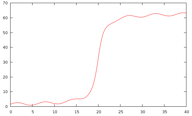
The problem is obvious: the function has some interesting modulation close to 0, and close to 60, but it is rather dull between these two extrema. The solution is to cut out the segment between 10, and 60, say.
What we will use is a very handy function in gnuplot 4.4, which lets the user set the position of the graph exactly. In a multiplot, we would usually set the position as
In gnuplot 4.4, however, one can set the positions of the plots, and not the whole graph. This is achieved by issuing a command similar to this
Having said this, our script could read as follows
The first couple of lines specify how big a figure we want to have: bm, lm, and rm are the bottom, left, and right margins, respectively. We also define the size of the gap, which we will have between the two plots. y1 through y4 are the definitions of our plot ranges. In other words, the interval between y2, and y3 will be cut out of our figure.
In the multiplot environment, we set the axes (for the bottom figure on the bottom, left, and right, while for the top figure on the top, left, and right), the axis labels (the vertical label we have to set by hand, for otherwise it would be centred on the vertical axis of the bottom or top figure, but not on the whole), and set the positions of the figures. Note that the definition used for tmargin and bmargin makes sure that the two plotted intervals are proportional. Before plotting the second curve, we also set four small headless arrows, which are meant to represent the break in the axes. It can be left out, if not desired, or they can be replaced by two dashed vertical lines.

This method can also be used, if one wants to plot a single curve or data set, but with logarithmic axis on one interval, and linear on the other.
plot [0:40] 20.0*atan(x-20.0) + 32 + sin(x)which would result in the following graph:
The problem is obvious: the function has some interesting modulation close to 0, and close to 60, but it is rather dull between these two extrema. The solution is to cut out the segment between 10, and 60, say.
What we will use is a very handy function in gnuplot 4.4, which lets the user set the position of the graph exactly. In a multiplot, we would usually set the position as
set multiplot
set size 1, 0.3
set origin 0, 0.5
plot 'foo' using 1:2

set size 1, 0.2
set origin 0, 0
plot 'bar' using 3:4
which produces two graphs of size 1, 0.3, and 1, 0.2, respectively, and places them in such a way that their bottom left corner is at (0, 0.5), and (0, 0). But when we say "the bottom left corner", we actually mean the whole figure, tic marks, axis labels, everything. This means at least two things. One is that if we want to break the axis using a multiplot, the ranges will not necessarily be proportional on the figure, simply because the size referred to the size of the whole graph, and not only to the plotting area. Second, if the size of the tic labels is different in the two graphs, they will no longer be aligned properly. This would happen, e.g., if we were to plot over the ranges [0:9], and [1000:10009]: the first range requires labels of width 1, while the second labels of width 5, therefore, the second graph would be narrower, and its left vertical axis shifted to the right, at least, as far as the plotting area is concerned.
In gnuplot 4.4, however, one can set the positions of the plots, and not the whole graph. This is achieved by issuing a command similar to this
set lmargin at screen 0.1which aligns the left vertical axis of the graph with the point that is at screen position 0.1 along the horizontal direction. There are three more margins, rmargin, tmargin, and bmargin, setting the right hand side, the top, and the bottom of the graph. Specifying the plot's corners explicitly removes the above-mentioned problem with the alignments.
Having said this, our script could read as follows
reset
unset key
bm = 0.15
lm = 0.12
rm = 0.95
gap = 0.03
size = 0.75
y1 = 0.0; y2 = 11.5; y3 = 58.5; y4 = 64.0

set multiplot
set xlabel 'Time [ns]'
set border 1+2+8
set xtics nomirror
set ytics nomirror
set lmargin at screen lm
set rmargin at screen rm
set bmargin at screen bm
set tmargin at screen bm + size * (abs(y2-y1) / (abs(y2-y1) + abs(y4-y3) ) )

set yrange [y1:y2]
plot [0:40] 20.0*atan(x-20.0) + 32 + sin(x)

unset xtics
unset xlabel
set border 2+4+8
set bmargin at screen bm + size * (abs(y2-y1) / (abs(y2-y1) + abs(y4-y3) ) ) + gap
set tmargin at screen bm + size + gap
set yrange [y3:y4]

set label 'Power [mW]' at screen 0.03, bm + 0.5 * (size + gap) offset 0,-strlen("Power [mW]")/4.0 rotate by 90

set arrow from screen lm - gap / 4.0, bm + size * (abs(y2-y1) / (abs(y2-y1)+abs(y4-y3) ) ) - gap / 4.0 to screen \
lm + gap / 4.0, bm + size * (abs(y2-y1) / (abs(y2-y1) + abs(y4-y3) ) ) + gap / 4.0 nohead

set arrow from screen lm - gap / 4.0, bm + size * (abs(y2-y1) / (abs(y2-y1)+abs(y4-y3) ) ) - gap / 4.0  + gap to screen \
lm + gap / 4.0, bm + size * (abs(y2-y1) / (abs(y2-y1) + abs(y4-y3) ) ) + gap / 4.0 + gap nohead

set arrow from screen rm - gap / 4.0, bm + size * (abs(y2-y1) / (abs(y2-y1)+abs(y4-y3) ) ) - gap / 4.0 to screen \
rm + gap / 4.0, bm + size * (abs(y2-y1) / (abs(y2-y1) + abs(y4-y3) ) ) + gap / 4.0 nohead

set arrow from screen rm - gap / 4.0, bm + size * (abs(y2-y1) / (abs(y2-y1)+abs(y4-y3) ) ) - gap / 4.0  + gap to screen \
rm + gap / 4.0, bm + size * (abs(y2-y1) / (abs(y2-y1) + abs(y4-y3) ) ) + gap / 4.0 + gap nohead

plot [0:40] 20.0*atan(x-20.0) + 32 + sin(x)

unset multiplot
The first couple of lines specify how big a figure we want to have: bm, lm, and rm are the bottom, left, and right margins, respectively. We also define the size of the gap, which we will have between the two plots. y1 through y4 are the definitions of our plot ranges. In other words, the interval between y2, and y3 will be cut out of our figure.
In the multiplot environment, we set the axes (for the bottom figure on the bottom, left, and right, while for the top figure on the top, left, and right), the axis labels (the vertical label we have to set by hand, for otherwise it would be centred on the vertical axis of the bottom or top figure, but not on the whole), and set the positions of the figures. Note that the definition used for tmargin and bmargin makes sure that the two plotted intervals are proportional. Before plotting the second curve, we also set four small headless arrows, which are meant to represent the break in the axes. It can be left out, if not desired, or they can be replaced by two dashed vertical lines.
This method can also be used, if one wants to plot a single curve or data set, but with logarithmic axis on one interval, and linear on the other.
Saturday 12 June 2010
Ministry of Sillier Walks
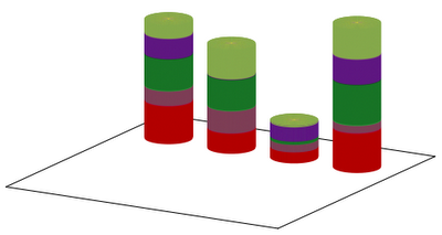
In my last post, I have shown how we can define or read an array of number from a file. Having constructed the array, the question naturally arises: can we use it for something else, to do something that we could not do otherwise. The answer is yes, although in the present post, there will not be anything that I haven't discussed here or there. We have only got to put the pieces together, and with a little bit of work, we can produce three-dimensional column stacked histograms at ease. I will use the same datafile, but I repeat it here:
Then, let us see, how we are going to make that histogram! For the sake of example, we will draw four cylinders, which will be striped according to the values that the columns in the data file take. We could do two things here. Provided that we have already read the values into an array, we could draw 4 times 5 cylinders of various size and colour. Alternatively, we could draw 4 cylinders, and colour them with stripes that we take from the palette. In this case, we have to find some way of defining the proper palette. Both methods have advantages and disadvantages. The advantage of the first one is that it is faster, because the cylinders are monocolour, which means that we need only two isosamples. On the other hand, we have to have "nested" for loops (which we would just simply write out). The advantage of the second method is that we can get away with one for loop, but we need many isosamples, because the cylinders contain many colour, though the transition between the colours is required to be abrupt. But since we do not know where the boundary between two colours is, we would need many isosamples. Consequently, it will be slow.
When defining our array, we will employ the trick from the last post, and we will do something very similar, when we determine our palette. In addition, we will also have to calculate the sum in the columns, for the cylinders' height should be proportional to that. If, on the other hand, we opt for re-scaling the cylinders to the same height, we, again, need the sum. With these preliminary remarks, the first version of our script could look like this
The first couple of lines set up the graph, and they are trivial, as is the plot to the 'cylinder.dat'. The definition of g(x,a) should be familiar from the last post, and h(x,a) is nothing but the Heaviside function. We have to deal with a matrix, therefore, the string ARRAY begins with "b(x,y) = 0", which will, in due course, become the definition of a two-variable function. SUM, that will bring s(x,a) to life, also appears to define a two-variable function, but this is only apparent: s(x,a) is exactly as much of a two-variable function as is g(x,a). A mere convenience, nothing more. We also begin the definition of a palette, but we stop short of its completion: that will be done during the first plot.
In the array(x,c) function, we read in the numbers from the file, and at the same time, we also calculate the sums in the columns. This function is really similar to that from the last post. We also define a function for filling up the palette. For now, this function writes random colours into the palette at every integer.
Having defined the functions, we "plot" our data file, so as to read in the numbers. We plot the second column of the same file again, in order to prepare our palette. Note that this latter plot is really nothing but a strange way of creating a for loop: we do something as many times as there are elements in a column. In both plots, by applying the every keyword, we skip the first line, which is the column header.
At this point we are almost done: the only remaining thing is the evaluation of our new definitions, and the actual plot. The setting of the xrange and yrange is necessary only in order to ensure that the cylinders are cylinders, not elliptical.
Our first script results in the graph below:
This is OK for a start, but could we improve it a bit? With some work, we could. For one thing, we could add the sum at the top of each cylinder. This can easily be done by augmenting the last plot with the line
We can also give a title to each cylinder by reading out the values in the first row. This is done by adding
Finally, we can easily add a legend to the figure. All we have to do is to read out the first column of our data file, and draw 5 cylinders with the appropriate colour. We can achieve this by invoking

Well, this is sort of OK, but what if we still do not like it? There are two things that we could easily implement, and would change the character of our graph completely. One is that we can give the cylinders a true 3D lookout, by adding phongs to them. The other one is that we could remove the legends, and add it to one of the cylinders.
So, let us see what we could do in the way of phonging. This is really simple: if we think about it, the phong is nothing but a white spot on our graph, where the saturation of the colours increases towards the centre of the spot. Therefore, all we have to do is to insert white into the palette, but to do it in a way that white saturates all little cylinders. We could, then, modify our palette function as
As for the labels, we might want to place them at the centre of each coloured cylinder in the last cylinder, representing Nauru. That is, we use the first column, and add the labels from that at half of the height of the cylinders whose size is read from the fifth column. We could use this function
With these modifications, the complete script reads as

I think I cannot add more to this figure, we have explored and exhausted all possibilities here. Next time I will come back to an older topic from this blog, and show how that can be done in an elegant way, applying the new functionalities of gnuplot 4.4.
Cheers,
Zoltán
"" France Germany Japan Nauru
Defense 9163 4857 2648 9437
Agriculture 3547 5378 1831 1948
Education 7722 7445 731 9822
Industry 4837 147 3449 6111
"Silly walks" 3441 7297 308 7386
Then, let us see, how we are going to make that histogram! For the sake of example, we will draw four cylinders, which will be striped according to the values that the columns in the data file take. We could do two things here. Provided that we have already read the values into an array, we could draw 4 times 5 cylinders of various size and colour. Alternatively, we could draw 4 cylinders, and colour them with stripes that we take from the palette. In this case, we have to find some way of defining the proper palette. Both methods have advantages and disadvantages. The advantage of the first one is that it is faster, because the cylinders are monocolour, which means that we need only two isosamples. On the other hand, we have to have "nested" for loops (which we would just simply write out). The advantage of the second method is that we can get away with one for loop, but we need many isosamples, because the cylinders contain many colour, though the transition between the colours is required to be abrupt. But since we do not know where the boundary between two colours is, we would need many isosamples. Consequently, it will be slow.
When defining our array, we will employ the trick from the last post, and we will do something very similar, when we determine our palette. In addition, we will also have to calculate the sum in the columns, for the cylinders' height should be proportional to that. If, on the other hand, we opt for re-scaling the cylinders to the same height, we, again, need the sum. With these preliminary remarks, the first version of our script could look like this
reset

unset key
unset colorbox
unset xtics; unset xlabel
unset ytics; unset ylabel
unset ztics
file = 'marimekko.dat'
cylinder = 'cylinder.dat'

set ticslevel 0
set border 1+2+4+8
set parametric; set urange [0:2*pi]; set vrange [0:1]; set iso 2, 200
set table cylinder
splot cos(u), sin(u), v, cos(u)*v, sin(u)*v, 1
unset table
unset parametric

col = 4
row = 5
sm = 0.0
g(x,a) = (abs(x-a) < 0.1 ? 1 : 0)
h(x,a) = (x <= a ? 0.0 : 1.0)

ARRAY = "b(x, y) = 0"
SUM = "s(x,a) = 0"
PALETTE = "set palette defined (-1 0.7 0 0"

array(x, c) = (sm = h($0,0.5)*sm + x, ARRAY = ARRAY.sprintf(" + g(x,%d)*h(y,%.3f)", c, sm), \
                SUM = SUM.sprintf(" + %f*g(x,%d)", x, c), x )
pal(x, c) = (PALETTE = PALETTE.sprintf(", %.1f %.3f %.3f %.3f", c-0.1, rand(0)*0.7, rand(0)*0.7, rand(0)*0.7), x
ff(x, c) = (array(x, c), x)

plot for [i=2:col+1] file every ::1 using 0:( ff(column(i), i) )
plot file every ::1 using 0:(pal(1, column(0)))

eval(ARRAY)
eval(PALETTE.")")
eval(SUM)

set xrange [4:5+3*col]
set yrange [-10:3*col-9]

splot for [i=2:col+1] cylinder using ($1+3*i):2:($3*s(i,i)):(b(i,$3*s(i,i))) with pm3d
The first couple of lines set up the graph, and they are trivial, as is the plot to the 'cylinder.dat'. The definition of g(x,a) should be familiar from the last post, and h(x,a) is nothing but the Heaviside function. We have to deal with a matrix, therefore, the string ARRAY begins with "b(x,y) = 0", which will, in due course, become the definition of a two-variable function. SUM, that will bring s(x,a) to life, also appears to define a two-variable function, but this is only apparent: s(x,a) is exactly as much of a two-variable function as is g(x,a). A mere convenience, nothing more. We also begin the definition of a palette, but we stop short of its completion: that will be done during the first plot.
In the array(x,c) function, we read in the numbers from the file, and at the same time, we also calculate the sums in the columns. This function is really similar to that from the last post. We also define a function for filling up the palette. For now, this function writes random colours into the palette at every integer.
Having defined the functions, we "plot" our data file, so as to read in the numbers. We plot the second column of the same file again, in order to prepare our palette. Note that this latter plot is really nothing but a strange way of creating a for loop: we do something as many times as there are elements in a column. In both plots, by applying the every keyword, we skip the first line, which is the column header.
At this point we are almost done: the only remaining thing is the evaluation of our new definitions, and the actual plot. The setting of the xrange and yrange is necessary only in order to ensure that the cylinders are cylinders, not elliptical.
Our first script results in the graph below:
This is OK for a start, but could we improve it a bit? With some work, we could. For one thing, we could add the sum at the top of each cylinder. This can easily be done by augmenting the last plot with the line
for [i=2:col+1] file every ::0::0 using (3*i):(0):(s(i,i)+5e3):(sprintf("%d", s(i,i))) w labels
We can also give a title to each cylinder by reading out the values in the first row. This is done by adding
for [i=2:col+1] file every ::0::0 using (3*i):(-2):(0):(stringcolumn(i)) w labels centre
Finally, we can easily add a legend to the figure. All we have to do is to read out the first column of our data file, and draw 5 cylinders with the appropriate colour. We can achieve this by invoking
file using (0):(0):(2e4-$0*5e3):1 w labels right, \
for [i=1:row] cylinder using ($1+5):($2-5.0):($3*2e3+i*5e3):(i-1) with pm3d
in the last plot. With these modifications, the complete script would look like this
reset

unset key
unset colorbox
unset xtics; unset xlabel
unset ytics; unset ylabel
unset ztics
file = 'marimekko.dat'
cylinder = 'cylinder.dat'

set ticslevel 0
set border 1+2+4+8
set parametric; set urange [0:2*pi]; set vrange [0:1]; set iso 2, 200
set table cylinder
splot cos(u), sin(u), v, cos(u)*v, sin(u)*v, 1
unset table
unset parametric

col = 4
row = 5
sm = 0.0
g(x,a) = (abs(x-a) < 0.1 ? 1 : 0)
h(x,a) = (x <= a ? 0.0 : 1.0)

ARRAY = "b(x, y) = 0"
SUM = "s(x,a) = 0"
PALETTE = "set palette defined (-1 0.7 0 0"

array(x, c) = (sm = h($0,0.5)*sm + x, ARRAY = ARRAY.sprintf(" + g(x,%d)*h(y,%.3f)", c, sm), \
                SUM = SUM.sprintf(" + %f*g(x,%d)", x, c), x )
pal(x, c) = (PALETTE = PALETTE.sprintf(", %.1f %.3f %.3f %.3f", c-0.1, rand(0)*0.7, rand(0)*0.7, rand(0)*0.7), x
ff(x, c) = (array(x, c), x)

plot for [i=2:col+1] file every ::1 using 0:( ff(column(i), i) )
plot file every ::1 using 0:(pal(1, column(0)))

eval(ARRAY)
eval(PALETTE.")")
eval(SUM)

set xrange [4:5+3*col]
set yrange [-10:3*col-9]

splot for [i=2:col+1] cylinder using ($1+3*i):2:($3*s(i,i)):(b(i,$3*s(i,i))) with pm3d, \
for [i=2:col+1] file every ::0::0 using (3*i):(0):(s(i,i)+5e3):(sprintf("%d", s(i,i))) w labels, \
file using (0):(0):(2e4-$0*5e3):1 w labels right, \
for [i=1:row] cylinder using ($1+5):($2-5.0):($3*2e3+i*5e3):(i-1) with pm3d, \
for [i=2:col+1] file every ::0::0 using (3*i):(-2):(0):(stringcolumn(i)) w labels centre
and would the following figure:Well, this is sort of OK, but what if we still do not like it? There are two things that we could easily implement, and would change the character of our graph completely. One is that we can give the cylinders a true 3D lookout, by adding phongs to them. The other one is that we could remove the legends, and add it to one of the cylinders.
So, let us see what we could do in the way of phonging. This is really simple: if we think about it, the phong is nothing but a white spot on our graph, where the saturation of the colours increases towards the centre of the spot. Therefore, all we have to do is to insert white into the palette, but to do it in a way that white saturates all little cylinders. We could, then, modify our palette function as
pal(x, c) = (PALETTE = PALETTE.sprintf(", %.1f %.3f %.3f %.3f, %.1f 1 1 1", \
      c-0.01, rand(0)*0.7, rand(0)*0.7, rand(0)*0.7, c+0.99), x)
and add a function that changes the saturation as colour(x,y) = 0.25*exp(-(x-0.7)**2/0.2-(y+0.7)**2/0.2)If we look at the palette function, the random numbers will be between 0-0.7, and the function colour(x,y) will add 0.25 to those numbers at the centre of the spot, which, in this particular case, will be at 45 degrees with respect to the x axis. When plotting, we have to add this function to our cylinders.
As for the labels, we might want to place them at the centre of each coloured cylinder in the last cylinder, representing Nauru. That is, we use the first column, and add the labels from that at half of the height of the cylinders whose size is read from the fifth column. We could use this function
lab(x) = (sm = sm + x, sm-0.5*x)The value of sm is updated when a new value is read from the fifth column, and the return value of the function is just the cumulative sum minus half of the last value. Note that since we use sm, which was also utilised in array(x,c), we will have to re-set its value to zero before we use it.
With these modifications, the complete script reads as
reset

unset key
unset colorbox
unset xtics; unset xlabel
unset ytics; unset ylabel
unset ztics
file = 'marimekko.dat'
cylinder = 'cylinder.dat'

set ticslevel 0
set border 1+2+4+8
set parametric; set urange [0:2*pi]; set vrange [0:1]; set iso 2, 200
set table cylinder
splot cos(u), sin(u), v, cos(u)*v, sin(u)*v, 1
unset table
unset parametric

col = 4
row = 5
sm = 0.0
g(x,a) = (abs(x-a) < 0.1 ? 1 : 0)
h(x,a) = (x <= a ? 0.0 : 1.0)

ARRAY = "b(x, y) = 0"
SUM = "s(x,a) = 0"
PALETTE = "set palette defined (-1 0.7 0 0, -0.5 1 1 1"

array(x, c) = (sm = h($0,0.5)*sm + x, ARRAY = ARRAY.sprintf(" + g(x,%d)*h(y,%.3f)", c, sm), \
  SUM = SUM.sprintf(" + %f*g(x,%d)", x, c), x )
pal(x, c) = (PALETTE = PALETTE.sprintf(", %.1f %.3f %.3f %.3f, %.1f 1 1 1", \
      c-0.01, rand(0)*0.7, rand(0)*0.7, rand(0)*0.7, c+0.99), x)
ff(x, c) = (array(x, c), x)

colour(x,y) = 0.25*exp(-(x-0.7)**2/0.2-(y+0.7)**2/0.2)
lab(x) = (sm = sm + x, sm-0.5*x)

plot for [i=2:col+1] file every ::1 using 0:( ff(column(i), i) )
plot file every ::1 using 0:(pal(1, column(0)))

eval(ARRAY)
eval(PALETTE.")")
eval(SUM)

set xrange [4:5+3*col]
set yrange [-10:3*col-9]

splot for [i=2:col+1] cylinder using ($1+3*i):2:($3*s(i,i)):(b(i,$3*s(i,i))+colour($1,$2)) with pm3d, \
for [i=2:col+1] file every ::0::0 using (3*i):(0):(s(i,i)+5e3):(sprintf("%d", s(i,i))) w labels, \
sm = 0, file using (3*col+4):(1):(lab($5)):1 w labels left, \
for [i=2:col+1] file every ::0::0 using (3*i):(-2):(0):(stringcolumn(i)) w labels right rotate by 30
I think I cannot add more to this figure, we have explored and exhausted all possibilities here. Next time I will come back to an older topic from this blog, and show how that can be done in an elegant way, applying the new functionalities of gnuplot 4.4.
Cheers,
Zoltán
Sunday 9 May 2010
Ministry of Silly Walks
In a comment last week, someone asked whether it was possible to draw a Marimekko plot, i.e., a histogram in which both directions contain relevant information. In other words, the question is whether we could draw a square, and populate it with rectangles in such a way that the area of the rectangles is read from a file. I thought that it should be possible, but on the way, I also found out a couple of interesting things. If you keep reading, you will see it for yourself, how we can define a vector, whose value is taken from a data file, and how we can manipulate the elements of that vector. In some sense, this is similar to the trick that we made use of, when we generated a parametric plot from a file. But we can do things in a slightly better fashion.
First, we will need a data file, and for the sake of conformity with the question of the commenter, I will just use this
(We can already deduce that with the sole exception of Japan, countries spend a large chunk of their GDP on silly walk.)
Now, our first attempt could be this:

It just falls short of our expectations in every respect: There is a gap between the columns, the colours are not consistent, and the width of the columns is equal. The only reasonable thing that happened here is that we can actually set the position of the columns. This will become important later on.
Let us try to improve on the figure, step by step. First, we will place the histograms in a multiplot, for that will make life a lot easier: this is our only way of manipulating the column width during the plot. In this spirit, our second script will be this:

This is somewhat better, for the colours are now consistent, and we also see that the last column has a different width. We also see how the positioning works: the right hand side of Japan's column is at 2.5, and since the width of Nauru's column is 0.3, its centre has got to be shifted by 0.15 with respect to 2.5. That adds up to 2.65. However, if we watch closely, we will also notice that the ytics and labels are drawn four times; after all, we have four plots. What, if we unset the ytics after the first plot? Well, we would end up with this

Rather upsetting! The problem is that once the tics are unset, the size of the figure changes, so we can no longer count on the plots' proper alignment. However, there is an easy remedy for this: all we have to do is not to unset the ytics, but to set them invisible. That is, we can do

We have already achieved quite a lot, and slowly, but surely, we are getting to our goal. Just do not despair!
The next thing that we would need is proper scaling of the columns: we want all of them to be between 0 and 100 (%), i.e., we would have to sum all columns first, and then divide the values by the sum. And that is the snag: we have four columns, and we have to do the summing for each column independently, and before the final plots. Otherwise, our multiplot will be messed up. And this is where the array comes in handy: if we just had an array, and could retrieve values from it, we would be saved. And of course, we can do this. Let us take a small detour!
If we think about it, the array (5, 4, 6, 7, 8) is nothing but a finite series: its first element is 5, second element is 4, and so on. But we could also look at the series as a function: a mapping from the set of natural numbers to, well, to anything. In the example above, to natural numbers. It doesn't matter. My point is that an array is a function, a function for which h(0) = 5, h(1) = 4, h(2) = 6, h(3) = 7, and h(4) = 8. As long as this is true, we do not care what h(1.1) is. We need the function's values only at integer numbers. Then the only question is how we could define this function "on the fly". Being a physicist, and a lazy man, I would propose the following:
After this digression, let us see what we can do with this, and issue the following commands!

So, we are almost there: the columns are rescaled, and placed neatly next to each other. The only missing ingredient is the setting of the widths. But that is really easy: we only have to determine what the grand total is, and then scale the columns accordingly. Our script can, then, be modified as follows

Adding labels to the rectangles is relatively easy: we could do the following
The last thing that I would add here is that by using macros, we can tidy up the script: we no longer would need all those long and repetitive lines. In fact, we could also add another instruction to our 'ff' function, which would generate the plot command. The advantage of that is that in this way, we do not have to repeat the plot commands four times: we simply put that in our for loop, and then evaluate the resulting string. I discussed this trick in my last post, so, if you are interested in the details, you can look it up there.
First, we will need a data file, and for the sake of conformity with the question of the commenter, I will just use this
"" France Germany Japan Nauru
Defense 9163 4857 2648 9437
Agriculture 3547 5378 1831 1948
Education 7722 7445 731 9822
Industry 4837 147 3449 6111
"Silly walks" 3441 7297 308 7386
(We can already deduce that with the sole exception of Japan, countries spend a large chunk of their GDP on silly walk.)
Now, our first attempt could be this:
reset

file = 'marimekko.dat'

set style data histograms
set style histogram columnstacked
set style fill solid border -1
set boxwidth 1.0

set xrange [-1:5]
set yrange [0:5e4]

plot newhistogram at 0, file u 2 title col, \
newhistogram at 1, file u 3 title col, \
newhistogram at 2, file u 4 title col, \
newhistogram at 3, file  u 5 title col, \
and it should be quite obvious that this is not what we want:
Let us try to improve on the figure, step by step. First, we will place the histograms in a multiplot, for that will make life a lot easier: this is our only way of manipulating the column width during the plot. In this spirit, our second script will be this:
reset

file = 'marimekko.dat'

set style data histograms
set style histogram columnstacked
set style fill solid border -1
set boxwidth 1.0

set xrange [-1:5]
set yrange [0:5e4]
set multiplot

plot newhistogram at 0, file u (f($2)) title col
plot newhistogram at 1, file u (f($3)) title col
plot newhistogram at 2, file u (f($4)) title col
set boxwidth 0.3
plot newhistogram at 2.65, file  u (f($5)) title col
unset multiplot
This is somewhat better, for the colours are now consistent, and we also see that the last column has a different width. We also see how the positioning works: the right hand side of Japan's column is at 2.5, and since the width of Nauru's column is 0.3, its centre has got to be shifted by 0.15 with respect to 2.5. That adds up to 2.65. However, if we watch closely, we will also notice that the ytics and labels are drawn four times; after all, we have four plots. What, if we unset the ytics after the first plot? Well, we would end up with this
Rather upsetting! The problem is that once the tics are unset, the size of the figure changes, so we can no longer count on the plots' proper alignment. However, there is an easy remedy for this: all we have to do is not to unset the ytics, but to set them invisible. That is, we can do
plot newhistogram at 0, file u (f($2)) title col
set ytics ("      ", 30000)
plot newhistogram at 1, file u (f($3)) title col
plot newhistogram at 2, file u (f($4)) title col
set boxwidth 0.3
plot newhistogram at 2.65, file  u (f($5)) title col
where we have 6 white spaces in the quote. You might wonder why on Earth 6. Well, the answer is that the label "30000" is actually " 30000", which takes up 6 characters' space. With this trick, we get We have already achieved quite a lot, and slowly, but surely, we are getting to our goal. Just do not despair!
The next thing that we would need is proper scaling of the columns: we want all of them to be between 0 and 100 (%), i.e., we would have to sum all columns first, and then divide the values by the sum. And that is the snag: we have four columns, and we have to do the summing for each column independently, and before the final plots. Otherwise, our multiplot will be messed up. And this is where the array comes in handy: if we just had an array, and could retrieve values from it, we would be saved. And of course, we can do this. Let us take a small detour!
If we think about it, the array (5, 4, 6, 7, 8) is nothing but a finite series: its first element is 5, second element is 4, and so on. But we could also look at the series as a function: a mapping from the set of natural numbers to, well, to anything. In the example above, to natural numbers. It doesn't matter. My point is that an array is a function, a function for which h(0) = 5, h(1) = 4, h(2) = 6, h(3) = 7, and h(4) = 8. As long as this is true, we do not care what h(1.1) is. We need the function's values only at integer numbers. Then the only question is how we could define this function "on the fly". Being a physicist, and a lazy man, I would propose the following:
g(x,a) = (abs(x-a) < 0.1 ? 1 : 0)
h(x) = 5 * g(x,0) + 4 * g(x,1) + 6 * g(x,2) + 7 * g(x,3) + 8 * g(x,4)
g(x,a) is (apart from some numerical factors) nothing but a very primitive representation of a Dirac-delta, centred on 'a'. You can convince yourself that h(x) defined in this way fulfils the requirements above.
After this digression, let us see what we can do with this, and issue the following commands!
ARRAY = "h(x) = 0"
array(x, counter) = ( ARRAY.sprintf(" + %f*g(x,%d)", x/100.0, counter+1) )
ff(x, counter) = (($0 > 0 ? ARRAY = array(x, counter-1) : 1), total = total + x, x)
plot 'marimekko.dat' using 0:(ff($2, 2))
At this point, the variable ARRAY should look something like thisARRAY = "h(x) = 0 + 91.630000*g(x,2) + 35.470000*g(x,2) + 77.220000*g(x,2) + 48.370000*g(x,2) + 34.410000*g(x,2)"and if we evaluate it, the function value h(2) returns the sum of the numbers in the second column. (Apart from a factor of 100, of course.) Note that in order to take out the first line, which is the header, we have to use the condition
($0 > 0 ? ARRAY = array(x, counter-1) : 1)which updates ARRAY only if we are processing the second record, at least. Also note that in order to get the sum of all columns, all we have to do is call this plot as many times as many columns there are. In the light of this, our next script could be this
reset

file = 'marimekko.dat'
col = 4

g(x,a) = (abs(x-a) < 0.1 ? 1 : 0)
ARRAY = "h(x) = 0"
array(x, counter) = ( ARRAY.sprintf(" + %f*g(x,%d)", x/100.0, counter) )

ff(x, counter) = (($0 > 0 ? ARRAY = array(x, counter) : 1), x)
plot for [i=2:col+1] 'marimekko.dat' using 0:(ff(column(i), i))

set xrange [-1:3]
set yrange [0:110]

eval(ARRAY);

set style data histograms
set style histogram columnstacked
set style fill solid border -1
set boxwidth 1.0

set multiplot
plot newhistogram at 0, file u ($2/h(2)) title col
set ytics ("    " 20)
plot newhistogram at 1, file u ($3/h(3)) title col
plot newhistogram at 2, file u ($4/h(4)) title col
set boxwidth 0.3
plot newhistogram at 2.65, file u ($5/h(5)) title col
unset multiplot
and this results in this figureSo, we are almost there: the columns are rescaled, and placed neatly next to each other. The only missing ingredient is the setting of the widths. But that is really easy: we only have to determine what the grand total is, and then scale the columns accordingly. Our script can, then, be modified as follows
reset
file = 'marimekko.dat'
col = 4

total = 0.0
g(x,a) = (abs(x-a) < 0.1 ? 1 : 0)
ARRAY = "h(x) = 0"
array(x, counter) = ( ARRAY.sprintf(" + %f*g(x,%d)", x/100.0, counter+1) )

ff(x, counter) = (($0 > 0 ? ARRAY = array(x, counter-1) : 1), total = total + x, x)
plot for [i=2:col+1] 'marimekko.dat' using 0:(ff(column(i), i))

set xrange [-0.3:1]
set yrange [0:110]
eval(ARRAY);

set style data histograms
set style histogram columnstacked
set style fill solid border -1

total = total / 100.0
position = 0.0

set multiplot
set boxwidth h(2)/total
plot newhistogram at position, file u ($2/h(2)) title col

set ytics ("    " 20)
set boxwidth h(3)/total; position = position + (h(2)+h(3))/total/2.0
plot newhistogram at position, file u ($3/h(3)) title col

set boxwidth h(4)/total; position = position + (h(3)+h(4))/total/2.0
plot newhistogram at position, file u ($4/h(4)) title col

set boxwidth h(5)/total; position = position + (h(4)+h(5))/total/2.0
plot newhistogram at position, file u ($5/h(5)) title col
unset multiplot
and this is what we wanted!Adding labels to the rectangles is relatively easy: we could do the following
plot file using (position):(l($5)):5 with labels tc rgb "#ffffff"where l(x) is a function that keeps track of the previous values of the column, and adds them as new values are processed. The definition of this function should be trivial.
The last thing that I would add here is that by using macros, we can tidy up the script: we no longer would need all those long and repetitive lines. In fact, we could also add another instruction to our 'ff' function, which would generate the plot command. The advantage of that is that in this way, we do not have to repeat the plot commands four times: we simply put that in our for loop, and then evaluate the resulting string. I discussed this trick in my last post, so, if you are interested in the details, you can look it up there.
Subscribe to:
Posts (Atom)